Summary:
To help customers choose the ideal location for their type of trip, the company set up a database with information about various locations around the world. The project's goal was to understand with users which information they found relevant and to create a simple visualization of the selected data for users.
The Project:
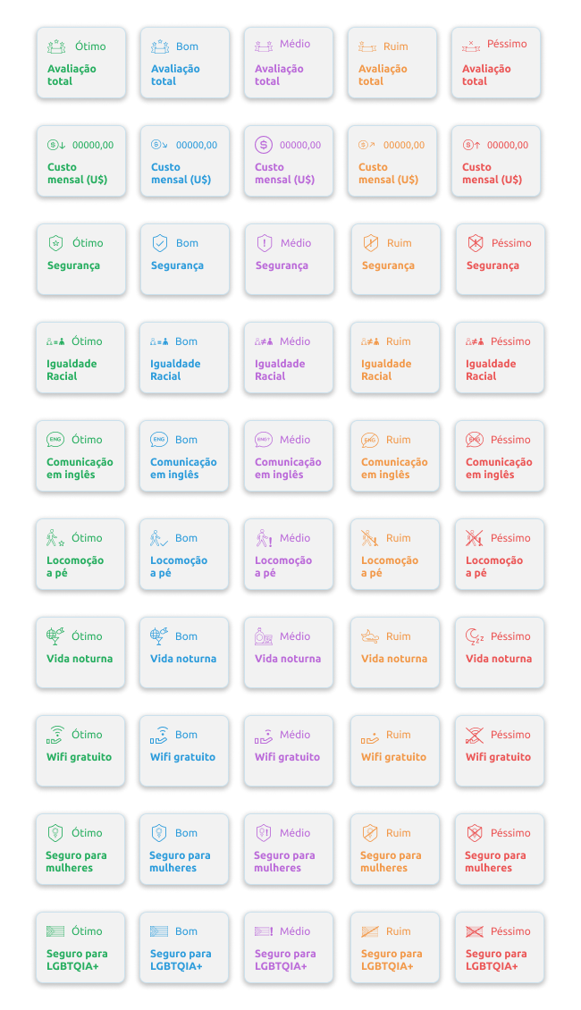
First, we analyzed the data in the database, how it was organized, what it informed, and how it conveyed the data. Then we conducted a simple survey where users listed the information from the database that they found most important to know when choosing a place to travel. From this analysis, we chose the top 10 most selected pieces of information.
Once we knew which information we would be working with, we created a simple visualization of the selected topics, differentiating them between excellent, good, medium, bad, and terrible, using colors for each level and icons for each type of data to facilitate user readability.


