Project Summary:
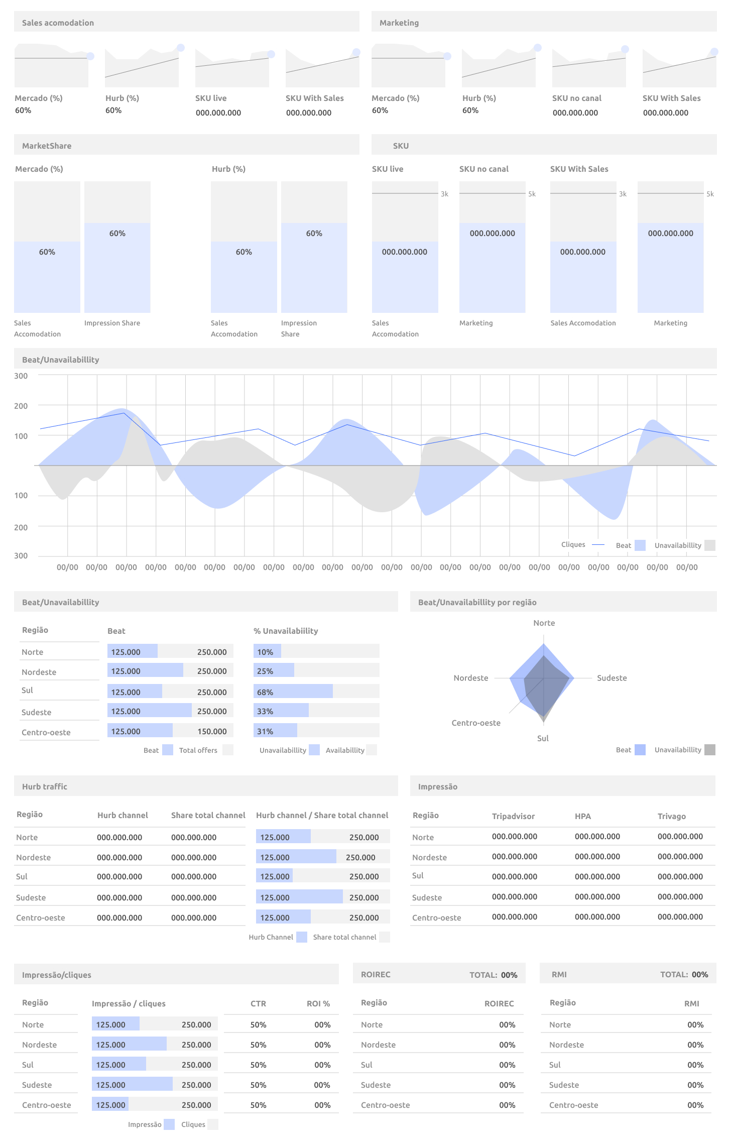
The project involved developing a dashboard for Hurb (an online travel agency) for use by the Commercial and Distribution teams (Marketing and Growth). The goal was to enable both teams to visualize and extract information to improve their performances based on the data presented, creating shared metrics between them.
Project Immersion:
To kick off the project, we held a meeting with the key leaders and experts from both teams. On the Commercial side, there were the Director and the Head, responsible for negotiating better rates with hotels and for pre-purchasing hotel nights, ensuring the best value for customers.
Representing the Distribution team were the Director of Marketing and Growth, along with their team, responsible for distributing the best offers to customers. One of the main strategies for this was the use of metasearch engines, such as Google Hotels and TripAdvisor.
The importance of the dashboard lay in its ability to help the teams rank the hotels offered by the company on metasearch engines. To achieve this, factors such as best price, best bid in the tool, and availability of hotel nights were considered. The dashboard provided clear data to the Distribution team about the hotels with which the Commercial team negotiated more availability at lower prices, allowing them to prioritize these hotels. On the other hand, it provided the Commercial team with information about the most sought-after hotels and destinations by customers, so they could focus their negotiation efforts.
Designing the Dashboard:
After discussing with both teams, I identified the key data relevant to both parties, understood the behavior of this data to choose the best way to present it visually, and determined the hierarchy to distribute it on the dashboard.
Additionally, I studied best practices in dashboard creation, consulting sources I had used before and some new ones. The three main sources were:

The article "Dashboards: Making Charts and Graphs Easier to Understand
written by Page Laubheimer for the Nielsen Norman Group website.

The book "The Big Book of Dashboards: Visualizing Your Data Using Real-World Business Scenarios"
by Steve Wexler, Jeffrey Shaffer, and Andy Cotgreave.

The book "Information Graphics"
by Sandra Rendgen and Julius Wiedemann.
Conclusion:
After the study phase, I created the initial wireframes and designs of the dashboard, which were crucial to materialize the ideas discussed with the teams and collect feedback from both areas, as well as from the development team. After this stage, I designed the final version of the project. It is important to mention that the design phase of the project lasted 3 days until the final version was completed.


